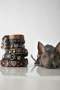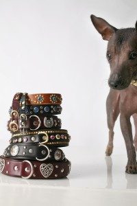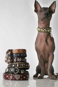


Our own little Xdog did a stellar photo shoot today but left us wondering which shot is best? All have great qualities, but which is your favorite? Why? Cast your vote and let us know…
p.s.uber thanks to Jesse Freidin for making our little girl shine!

I like 2 bc the dog is looking at the collars and I like the movement implied by the cropping.
Hubby likes 3 bc of the contrast between collars and dog.
I like A, C, & B in that order! Cute and oh sooo cool, or what!
A gets my vote!
the pieces look rich, full, almost like crown jewels.
the reflection add a lot to the image… it might add even more if it reflected the subject in full.
B is also nice, but too much focus on the pup for me. these pieces speak for themselves; they are stunning, Xochitl is the accessory. only when it comes to this ad, of course 😉
I like C the best, but A is also wonderful. And B is great, but the other two seem a bit stronger than it, but I really don't think you can lose with any one of them since all 3 are teriffic!
A or C. I'm being super picky but the blurriness on the D ring on the bottom collar bothers me on B.
X's collar is awesome btw.
I like C, because it shows off X's collar nicely and she looks so well mannered! (And check the focus in her eyes!) Also, the “2 column's effect” fills up the frame just enough.
o.k.–my opinion only…C is really just a “standard” shot, and A shows what a cutie-pie X-dog really is , but the motion implied ,along with her focus on the collars ,makes B my choice.
Thanks for your input, we're leaning towards that one too.
Take Care,
–Tim
https://www.pacocollars.com
C for sure!